It’s a well-known fact that the average website visitor makes a decision, largely an unconscious one, whether to play ball in just a few seconds. Naturally, a decision made in less than a minute isn’t based on facts, but rather emotions or instincts.
And it just so happens to be that these decisions are governed by the small almond-shaped neuron sets known as the amygdala.
The truly astonishing fact is that our amygdala is so similar to that of a lizard, that when you’re gearing your website towards maximum opt-in rate by your visitors, you could just as well be tweaking your website to improve conversion for lizard clients.
That is, provided they knew how to read and get to your website.
 A high-power vacuum cleaner AND a free bonus keychain? Count me in!
What You Can Learn from Lizards
The first thing that might pop into mind – which ones? Chameleons, geckos, leopard lizards – which ones are most like my website visitors? Quite frankly the type of lizard doesn’t matter one bit.
Albeit it may be interesting to imagine how your website would work in terms of conversion rate for various lizard species, they key idea is to take a closer look at the way lizards make decisions, relying mostly on the amygdala, much like your average website visitor.
This almond-shaped part of our brain controls our memories, emotional reactions and is the actual home of the gut feeling. When a lizard is chased by a snake, it is the amygdala commands the poor reptilian to drop their tail as a means of diversion.
If the lizard spent time considering all the pros and cons of leaving the tail behind, it would probably be suffering the fate of slow digestion in the belly of the snake before even coming to a decision.
This is exactly how an average website visitor functions – their gut tells them whether to stay on the page, and only if the initial screening passes, does the logical consideration and actual reading of your copy take place.
American psychologist Robert Orstein calls the amygdala our “old brain”, the marketing genius and best-selling author Seth Godin coins the term “lizard brain” for it.
In his book Linchpin: Are You Indispensable? Godin elaborates the term, saying that the idea of the lizard brain is – it is hungry, it is scared, it is selfish and it is horny. That’s its job and it is all it does.
It is responsible for our most primitive instincts, and they play a large role in marketing, whether you like it or not.

The amygdala was in charge of you in high school.
Don’t Make the Lizards Confused
Keeping in mind that all your potential and recurring clients have “lizard brains”, you should re-evaluate your website’s environment.
Keep the design simple, clean and without excess clutter – needless menus, links or a plethora of call-to-action buttons. These are equivalent to a snake chasing a lizard on its heels, and they’ll surely result in your visitor leaving the website sooner rather than later.
Service providers often find themselves agreeing with this statement but failing to find ways to minimize the vast amount of information and choices they have to offer. This too can be explained by primitive human psychology.
Taking pride in one’s work is one of the basic instincts (in fact, it might be governed by amygdala too), and it is one of the most common reasons for alienating visitors just moments after they’ve stumbled upon your website.
As for initial impressions, less is more, and you should give your lizards just a tease to get them interested, not drop the whole mother load on them all at once.
 A Ford dealership website – we have this, that and a bunch of these.
Part of the problem is the argument that choice and information is always a good thing.
But psychologist Barry Schwartz makes a rather counterintuitive, but very compelling, argument on the matter, saying that too much choice is actually a bad thing, causing unhappiness and decision paralysis.
That’s a simplistic rendering of Schwartz’s argument from his book The Paradox of Choice and his TED talk.
Obviously, there is a difference between having a lot of political candidates to choose from during an election and having a plethora of payment plan choices on a website, but you get the gist.
People think they want to consider all arguments and make a decision founded on facts and arguments, but in reality having fewer options makes it easier to arrive at a choice confidently and quickly.
The latter is especially important nowadays when people tend to browse shop and schedule on the go.
If your visitor is looking for a new knife set while waiting in line for lunch, they probably won’t have the time to read all there is to know about your offer.
Feed the Lizards Clues
Even though the variety of choices should be minimized and focus more on being obvious rather than being thorough, the website should convey your strongest point right from the first second.
Your front page should be occupied by prominent (but not excessive) call-to-action buttons, an explanatory tag line, logical color contrasts. They’re not supposed to describe your offer in depth, but instead get people to act.
If a client doesn’t understand where to sign up or what you are selling in the first few seconds of their visit, their lizard brains tell them to drop their tail flee with their search terms back to the Google forest.
A large part of overcoming the problem lies in the hands of the copywriter, as the text needs to be clear and concise, yet enticing enough to get the visitor to act.
At the same time, the design needs to complement your idea and give your visitors intuitive clues on how to interact with the website.
An article published in ACM Interactions titled “Signifiers, not affordances” explains the concept: “People search for clues, for any sign that might help them cope and understand. It is the sign that is importance, anything that might signify meaningful information. Designers need to provide these clues.”
 Flashy colors aren’t clues, they’re a burden.
 All the motivation to sign up, delivered in less than 5 seconds.
Treat Yourself Like a Lizard
As amusing as it may sound, positioning your business and website in a manner that it was made by lizards for lizards it will subsequently boost you clientele rate because of a psychological familiarity.
In other words, your inner lizard will connect with that of your client.
An interesting read titled The Emotional Brain: The Mysterious Underpinnings of Emotional Life by neuroscientist Joseph Ledoux suggests that emotion is the trigger to action and these actions, and almost all marketers use this to their advantage.
This is especially true for well thought-out non-profit or charity campaigns that appellate solely on the emotional part of decision-making.
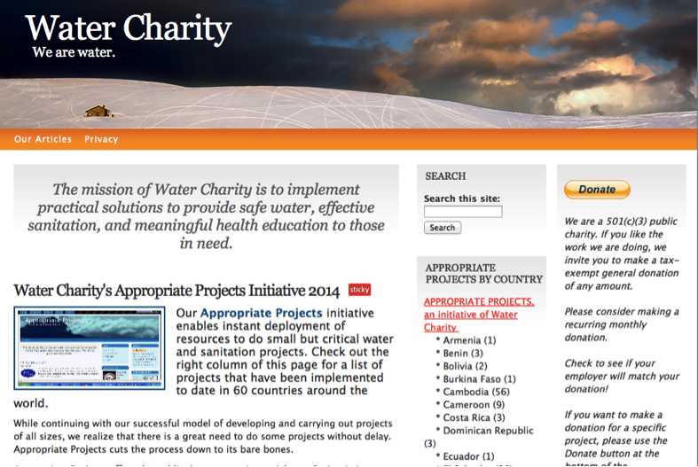
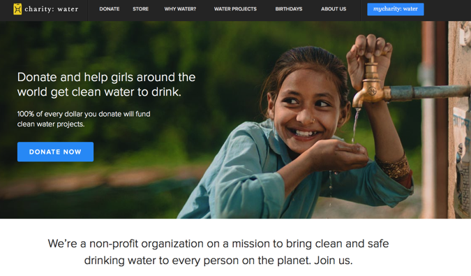
Let’s have a quick look at two charities, both raising funds for clean water.
Which One Would You Donate to?
 Option #1
 Option #2
Final Thoughts
In order to subsequently boost sales, remember about the lizard brains of you and your clients. Keep to the point, don’t overdo you color scheme and don’t clutter excessively, or else you will scare them off.
A good exercise is to write every single topic you would like to see on your front page, and then try to describe it in one word. See how much of that makes sense, and combine your new key phrases to form short and compelling selling points.
This way you get to the very essence of your offer, and avoid the mistake of trying to say too much at once, which would more likely than not ruin the first impression.
The first impression is everything, and proper website layout will ensure that the amygdala tells your visitor to stay, rather than flee.
Perhaps watching a nature documentary on lizards should be a part of the modern marketer’s curriculum. After all, if every aspect of the environment is made for a lizard then a lizard you will lure.
What do you think about this approach? Looking forward to your comments!
And as always, do not forget to join my list!
Enes
Leave a Reply
You must be logged in to post a comment.