 I am surprised when I stumble upon a website offering conversion optimization services or consultancy, but lacking basic principles of a successful landing page.
Instead of critiquing random websites for bad examples, today I decided to do those sites.
Here are 5 of them:
1) Conversion Breakthrough
(click on image to see big version)
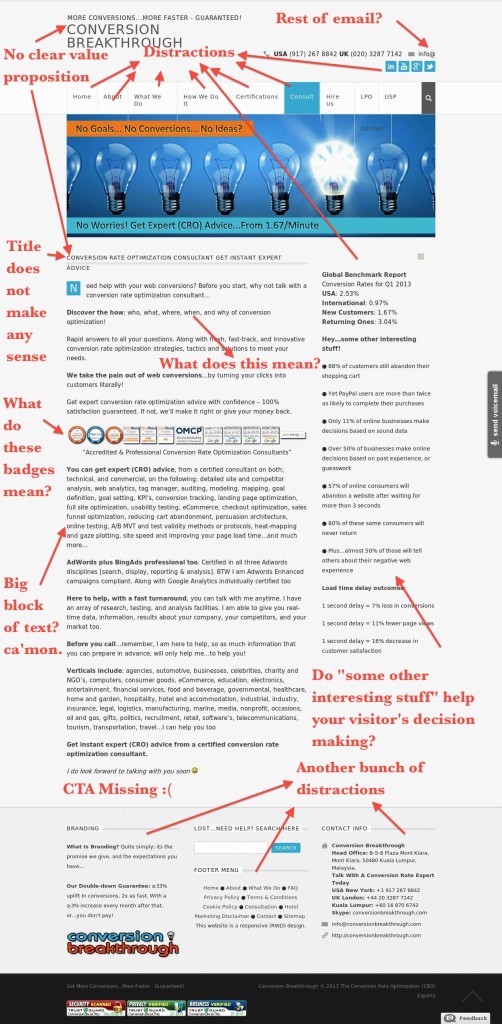
This fellow offers conversion rate optimization services but it is difficult to tell how he is doing that reading this page.
Let’s dive into the problems:
1) No value proposition or proper logo/tagline. “More conversions… More faster, Guaranteed. “ I am not a native speaker but can you say “More faster?”, sounds weird to me anyway. Other than that, it is impossible to understand if what offered is a service, book, or tool. Title says nothing.
2) Info@ what? They provided some phone numbers and email. Wait, what? There is nothing after @ symbol. They’ve forgotten to write the rest of email address.
3) How about the title? “Conversion Rate Optimization Consultant Get Instant Expert Advice”. Does this make any sense? Does it reflect the way they help increasing your conversions? No.
4) Bunch of badges means nothing. They’ve put the same badge three times side by side. The redundant badges are meaningless and completely irrelevant. .
5) Big block of text and poor copywriting. Text is full of grammar mistakes and statements that do not make sense. Paragraphs are big and hard to read. Bullets, numbering, or images are not used.
6) Call to Actions missing. We don’t know what to do after reading. Should we call them? How much does it cost to call them? Where is the number? Can we call 7/24? Where are they?
7) Hey.. Some interesting stuff. There are what they call interesting stuff mostly related to website speed at the right-hand side menu. Are they offering faster hosting services? No. Do these interesting stuff ease decision-making? No. Then why are they there?
8) Bunch of distractions. Tons of links everywhere going to places possibly these guys don’t want us to go. Would they want us to click LinkedIn page of them? No, but these links are there.
2) David Crowther
(Click on image to see big version)
Okay, first of all, I had to cut most of the experience of David since he had a lot of experience and I didn’t want to have a long page for you to scroll.
Let’s criticize this landing page:
1) Title is “Hi, I am David”. Title is the first thing visitors look in a page and when we are visiting a website for the first time, we’d expect a logo and/or a tagline explaining what we can get from here. Hi, I’m David is not something we need to know.
2) Long paragraphs with information but why? Okay, it is good to have experience, but do we really need this whole bunch of information? No, too many details and text are boring and make it hard to keep concentrated. Also, I’d like to see how things worked out in terms of CRO with those companies. How much are conversion rates of those companies increase?
3) About me. We’ve been reading bunch of stuff about David and we come by another title: About me. No comment on this. It is not needed there.
4) Contact form is badly designed. Design of contact form is broken and CTA button is not aligned with the form. It is also missing elements like trust signals (no spam policy etc.), required fields, and information on what happens after filling the form.
3)Rhodes
(Click on image to see big version)
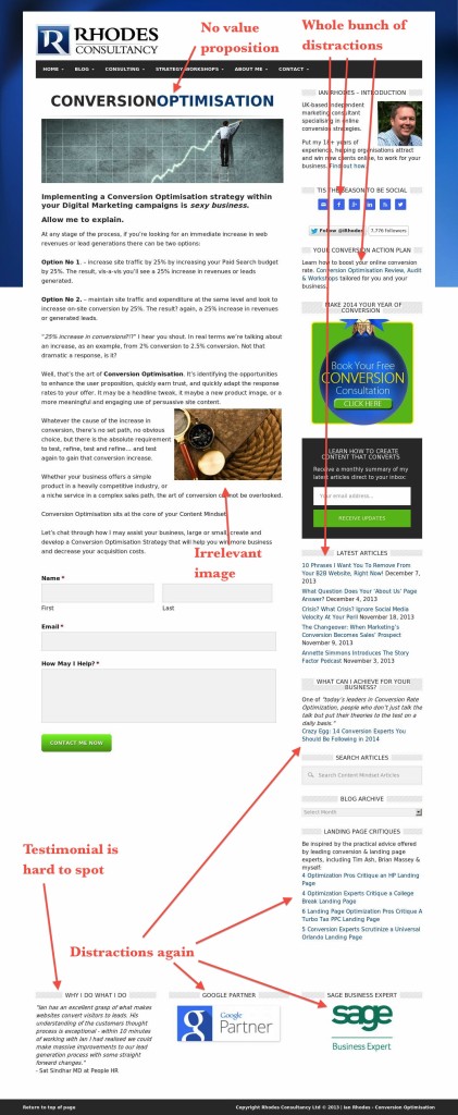
I have to admit there is a good example of copywriting there but in terms of conversion rate optimization, there are a lot of elements missing.
They’re
1) No value proposition. Just a title: “Conversion Optimisation”.
2) Page is full of distractions again. Lots of options, lots of links to click. One landing page should only have one goal.
3) Testimonial in the bottom. Testimonial in a page is a must. However, it should be in the content or near to CTA. Positioning is wrong here
4) I’d test different images since it is clear that stock images are conversion killers, especially if they are irrelevant.
4) SEO Consultant Specialist
(click on image to see big version)
Here is a one business owner either doesn’t know the difference between SEO and CRO, or very lazy to create different landing pages for both.
Problems:
1) Value proposition again. What does “Taking your business to top” mean? No clear statement on how a visitor can benefit of their service. In what way are you offering help to your potential customer?
2) SEO or CRO confusion. Text tells about their CRO service but there is a “Why SEO?” title there listing benefits of buying SEO services. Also, in the testimonial, we read about their SEO service. What offered in the page isn’t clear.
3) Testimonial Page. Having a separate testimonial page sucks. You need to include it in your offer in order to ease decision making by reminding people how other people benefited and happy about your service. No one will go to separate testimonial page.
4) Bad CTA. Only a small link: Contact us. Difficult to spot, badly positioned, and doesn’t offer value. “Learn more about our services” style CTA would be much better.
5) Site Ladder
(Click on image to see big version)
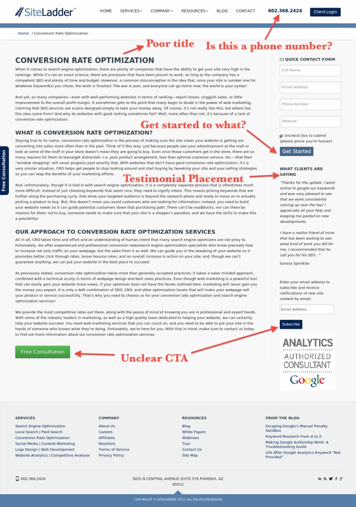
Site ladder is a good name for a CRO service but their website is in a need of a CRO work.
1) Poor title. Same as others. Title does not tell what this is all about.
2) Big, boring text. There is no bold or bullet points used. Looks like a TXT document..
3) Poor CTA buttons. In one CTA, button says: “Free Consultation”. In fact, it is not a CTA at all because there is no call for any actions. The other CTA is on the right menu and it is a subscription button which is irrelevant to the CRO service they are offering.
4) Unclear numbers at the top. They’ve written their phone number at the right corner of their websites. There are two problems with it. First, it is difficult to tell if it is a phone number of some kind of IP. Second, there is no CTA next to it. Writing a number is not enough, they need to tell people to call them. Plus, they need to add WHY
Take Home Messages
Have a strong value proposition. To achieve this make your titles as informative as possible about your business. Use tagline if you want to say more.
Use CTAs properly. Have only one CTA and make it visible to your visitors. Use contrasting colors and make it stand out. Tell people exactly what to do and what to expect after the action you want them to take.
Include testimonials in the copy. Do not create a separate testimonials page. Instead throw them inside your text and make them close to your CTA.
Remove distractions. One landing page needs to have only one action. Remove all irrelevant links, ads, or social buttons. You don’t want your visitors to go away by clicking your Facebook page link (They’ll probably see some notifications and forget about you in a second).
Follow me on Google+ and Twitter: It is for obvious reasons 🙂
Like and share this post if you enjoyed (It helps a lot) and don’t forget joining my list to get notified when I post something new.
Looking forward to your comments,
Enes


Great post with a thorough insight into what kind of things to implement on our own sites cheers Enes.